To enhance the look and feel of the Product Reviews Widget on your store, you can customize various design elements to match your branding.
To customize the Product Reviews Widget on your store:
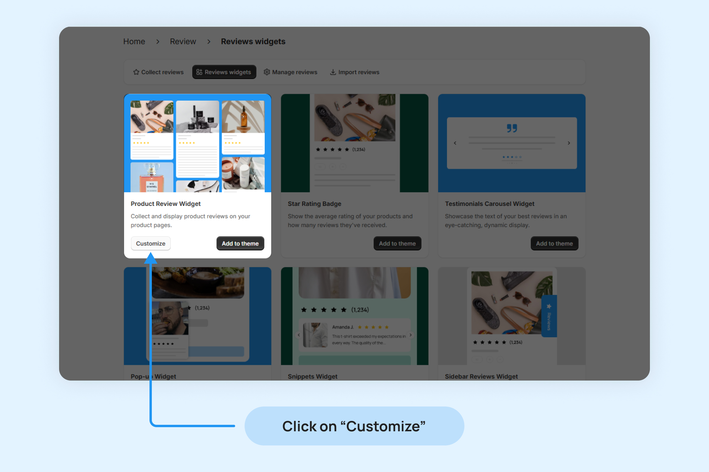
Navigate to Reviews -> Reviews widgets -> Product Reviews Widget and click on Customize.
Widget Layout
Choose the layout that best fits your store’s design and ensures a smooth user experience for your customers.
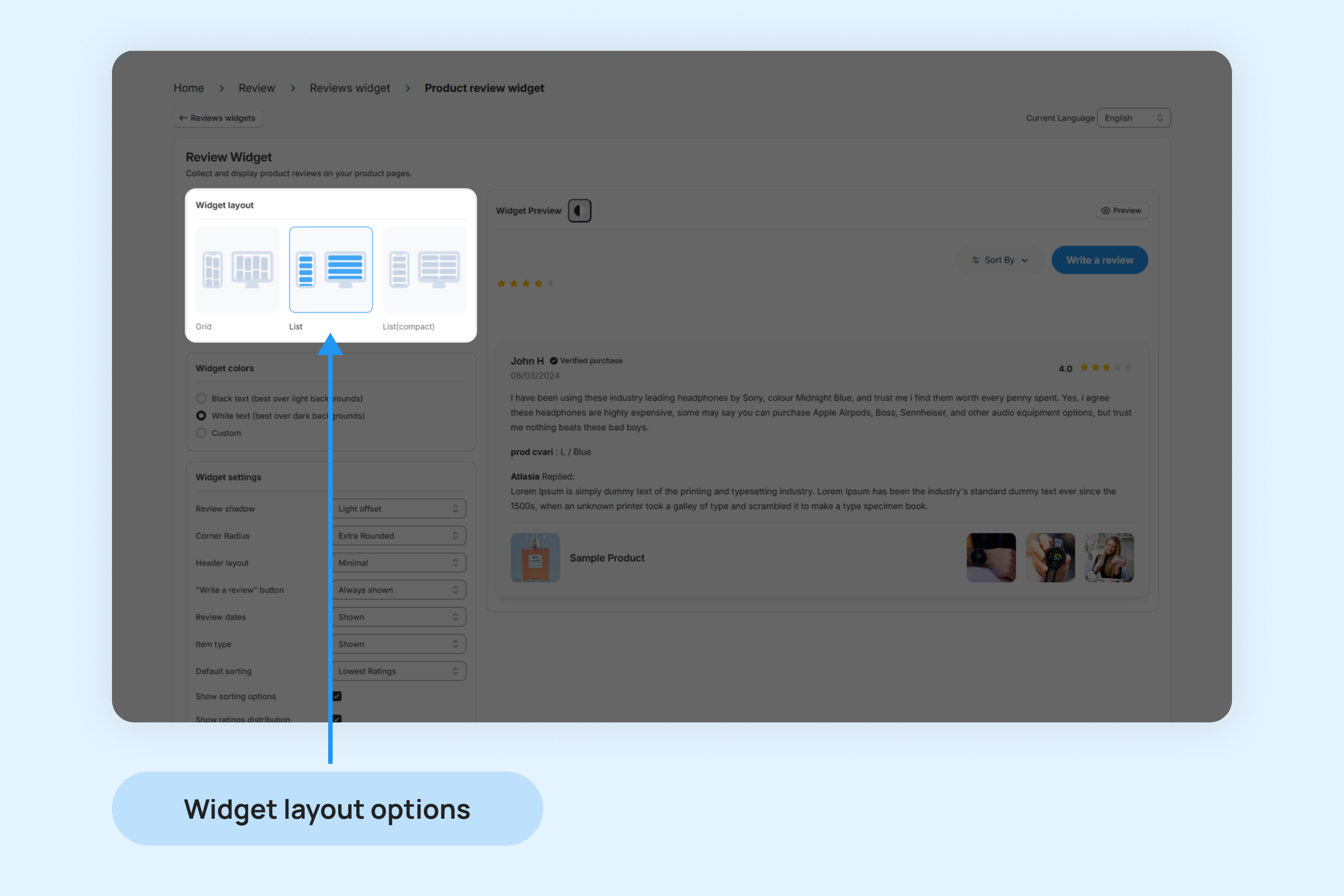
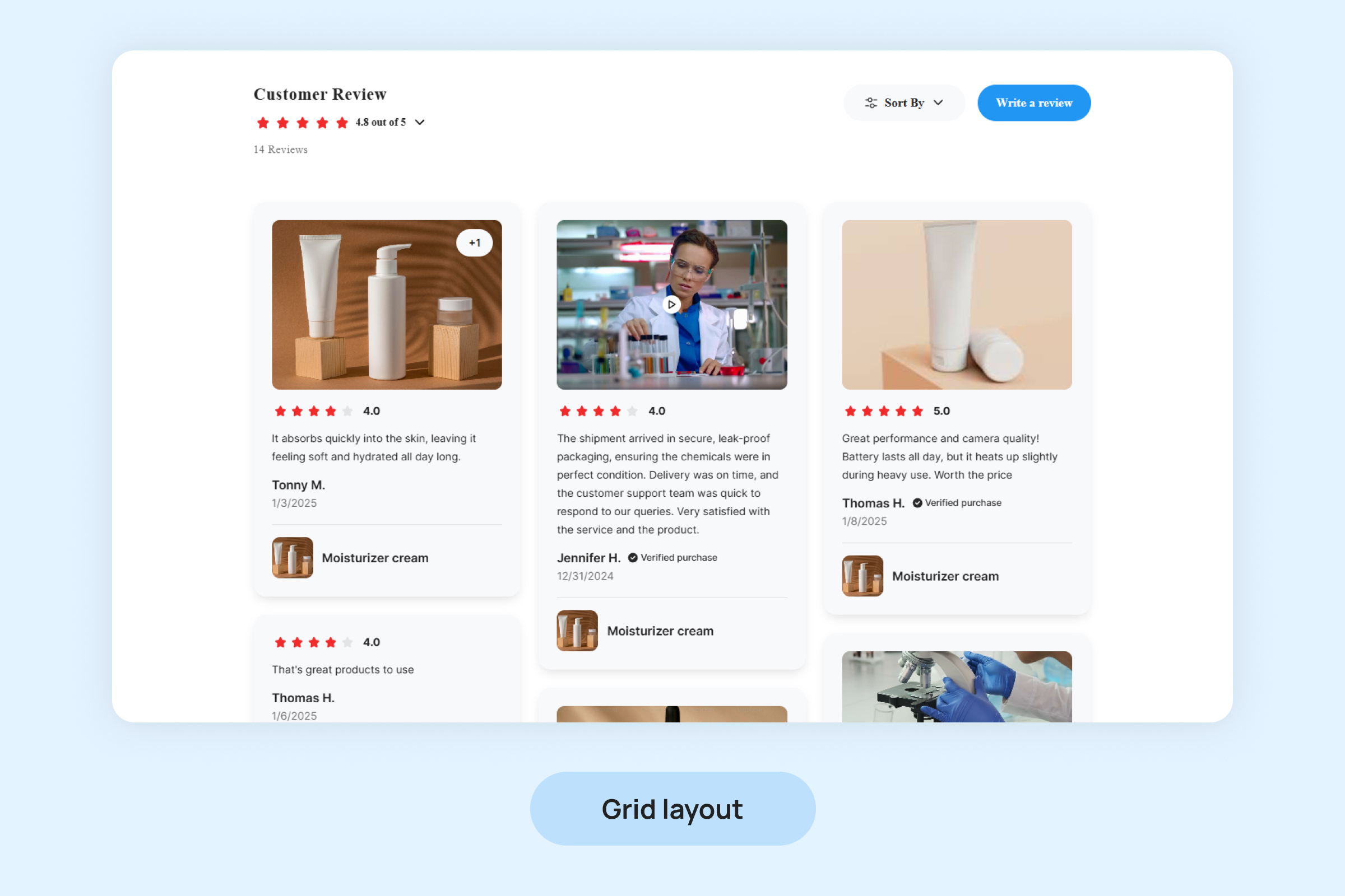
- Grid : Displays reviews in a grid format, with each review occupying a fixed space. This layout is ideal for stores with a lot of visual content, as it can accommodate multiple reviews in a structured grid view.
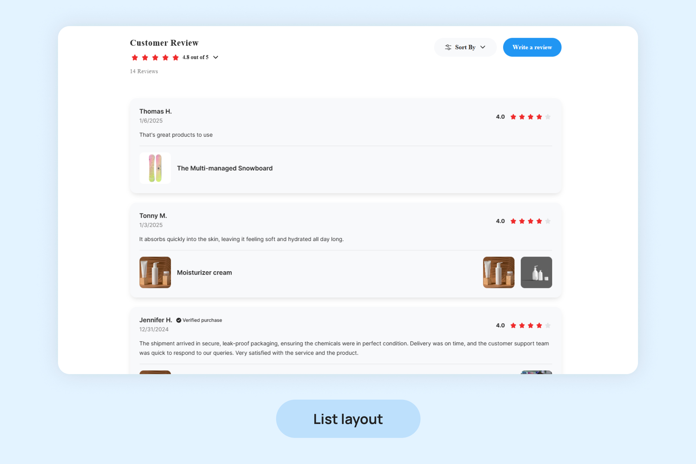
- List: Organizes reviews in a vertical list format. Each review is stacked on top of the other, allowing customers to easily scroll through and read individual reviews.
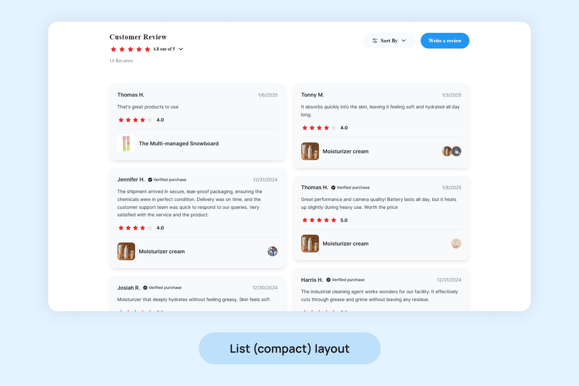
- List(compact) : Similar to the List Layout but more condensed. The reviews appear in a tighter format, showing less detail but still allowing users to browse through them quickly.
Widget Colors
To ensure the Product Reviews Widget complements your store’s branding, you can customize its appearance by selecting from the following color options:
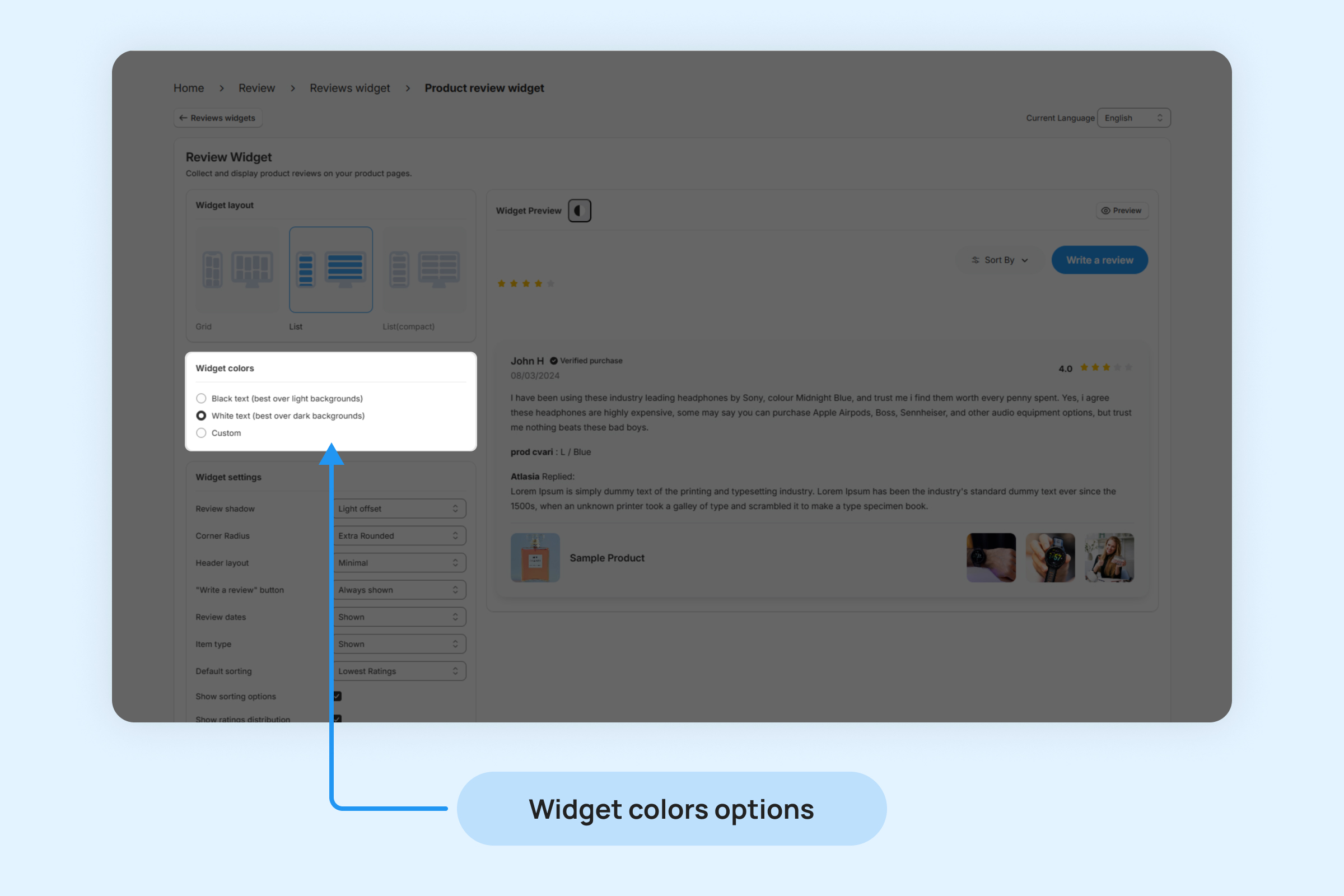
- Black Text: Ideal for light-colored backgrounds, ensuring readability and a clean, professional look.
- White Text: Best for dark-colored backgrounds, providing high contrast and visibility for a sleek, modern design.
- Custom: Allows you to fully customize the text color to match your brand’s unique color scheme, giving you complete control over the widget’s appearance.
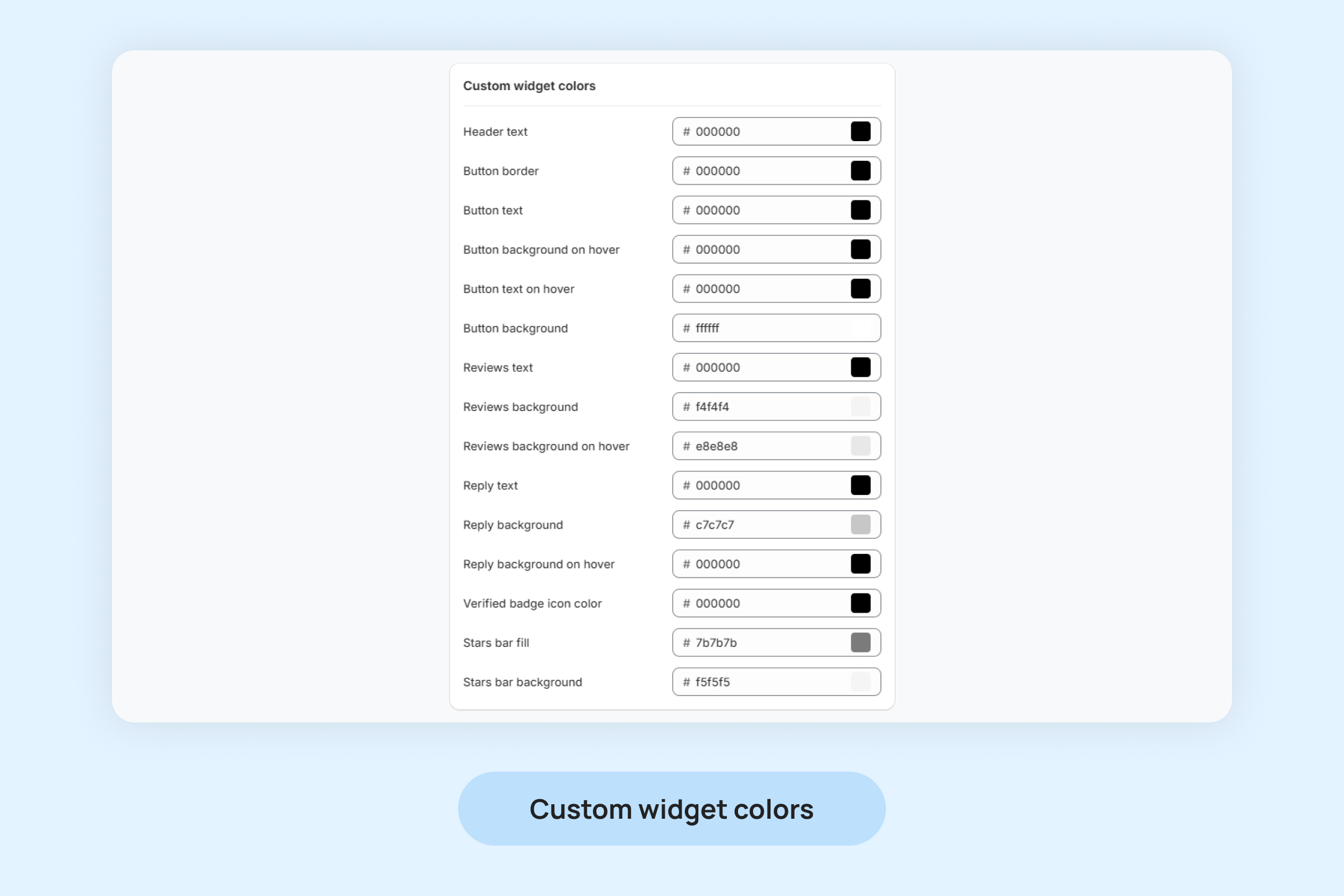
- Header text: Customize the color of the text in the header section of the widget. This is typically the title or label displayed at the top of the widget.
- Button border: Set the color of the border around the button within the widget. This controls the outline of clickable elements, such as the “Sort By” or “Write a reviews” button.
- Button text: Adjust the color of the text displayed on buttons within the widget.
- Button background on hover: Choose the background color of the button when the user hovers their cursor over it.
- Button text on hover: Set the color of the text on buttons when hovered over by the user.
- Button background: Customize the background color of buttons in their default state. This determines the button’s look when it is not being interacted with.
- Reviews text: Adjust the color of the text within the reviews section, such as the reviewer’s name, review title, and description.
- Reviews background: Set the background color of the review boxes
- Reviews background on hover: Choose the background color when hovering over the individual review boxes.
- Reply text: Customize the color of the text for replies to reviews. This applies to the text shown when a store owner or moderator responds to a review.
- Reply background: Adjust the background color behind replies to reviews.
- Reply background on hover: Set the background color of the reply section when hovered over.
- Verified badge icon color: Choose the color for the verified badge icon.
- Stars bar fill: Customize the color of the filled portion of the star rating bar, which visually represents the average rating for the product.
- Stars bar background: Set the background color of the empty part of the star rating bar, which serves as the baseline for the rating.
Widget settings
Widget settings allow you to control and customize the functionality and appearance of your product reviews widget.
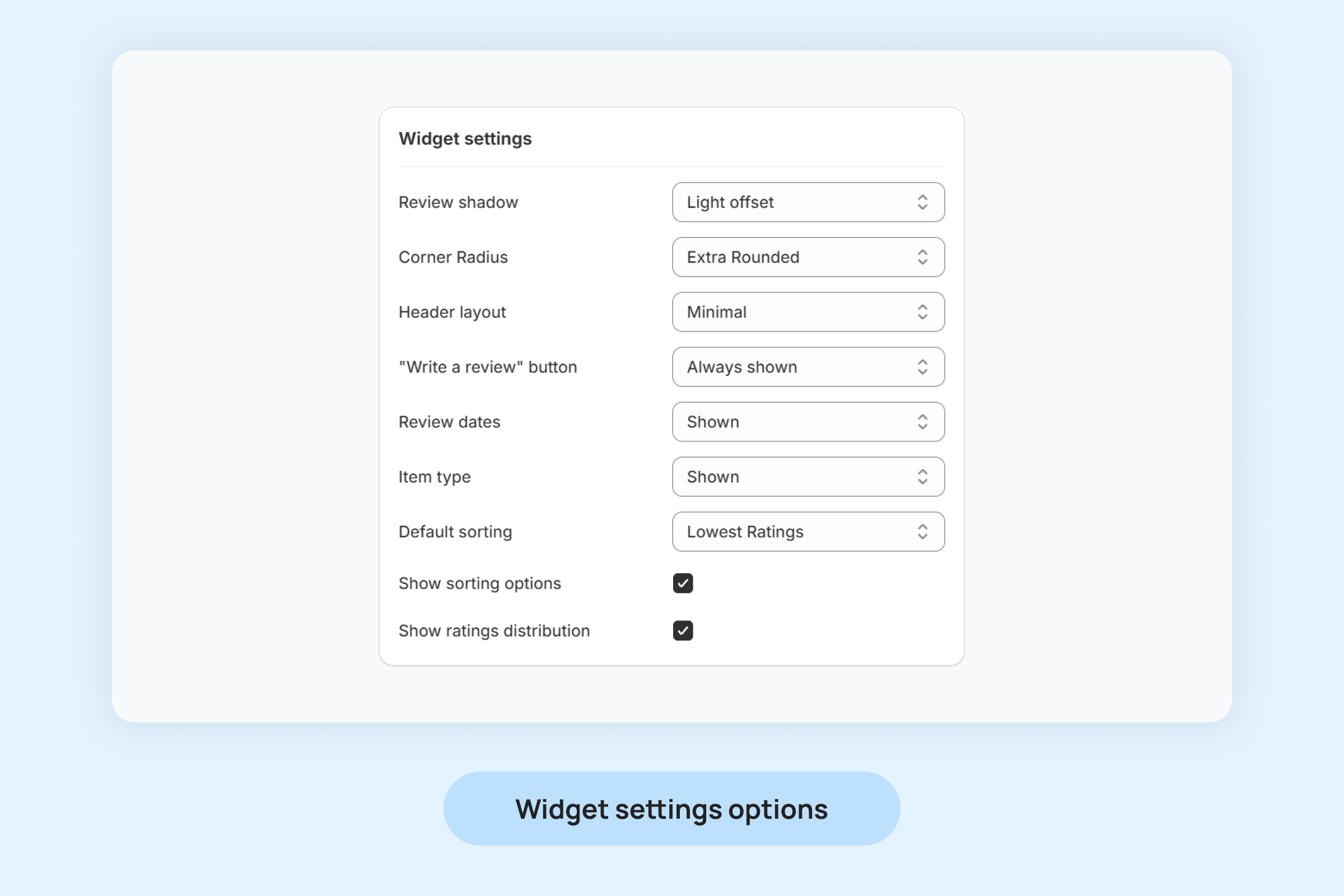
- Review shadow: Add a shadow effect to the review boxes to make them stand out from the background.
- Corner radius: Set the roundness of the review boxes’ corners.
- Header layout: Customize the arrangement of elements in the widget’s header. Options may include aligning the title, star rating, or sorting buttons in different formats.
- “Write a Review” button: Enable you to Allows “Write a Review” on product page.
- Review dates: Show or hide the date of each review based on your preference
- Item type: Enable to display the product variant on the review card.
- Default sorting: Choose the default sorting method for the reviews list.
- Show sorting options: Enable or disable sorting options for users.
- Show ratings distribution: Display a breakdown of ratings (e.g., the number of 5-star, 4-star, 3-star ratings) to provide customers with an overview of how the product or service is rated.
Widget Texts
Personalize the text on your widget’s buttons and elements to suit your requirements. You can modify the text for the following widget components.
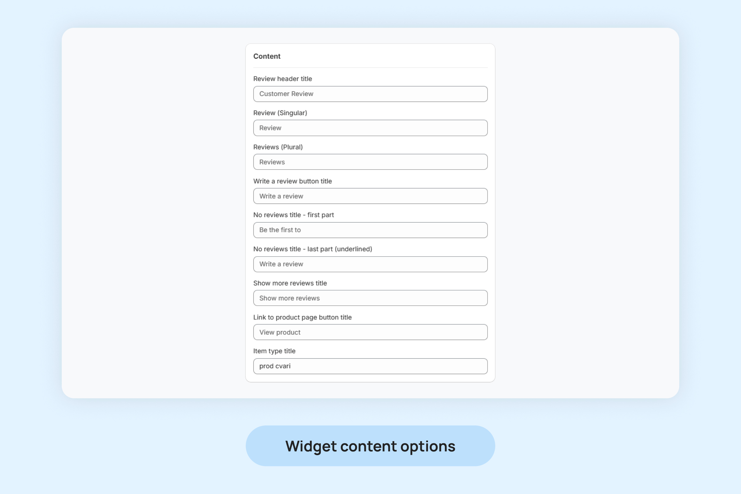
- Review Header Title: The main heading displayed at the top of the review section, often used to grab attention and indicate the purpose of the section (e.g., “Customer Reviews”).
- Review (Singular): The label used when referencing a single review, ensuring grammatical accuracy (e.g., “1 Review”).
- Reviews (Plural): The label used when referencing multiple reviews, providing a clear count (e.g., “25 Reviews”).
- Write a review button title: The text displayed on the button that invites customers to leave their own review (e.g., “Write a Review”).
- No reviews title – first part: The initial portion of the message displayed when no reviews are available, often setting the tone (e.g., “Be the first to.”).
- No reviews title – last part (underlined): A clickable, underlined part of the no-review message encouraging customers to take action (e.g., “Write a review”).
- Show more reviews title: The text for the button that allows users to load additional reviews (e.g., “Show More Reviews”).
- Link to product page button title: The text displayed on the button that redirects users to the product’s page for more details (e.g., “View Product”).
- Item type title: The label used to display the product variant associated with a review.
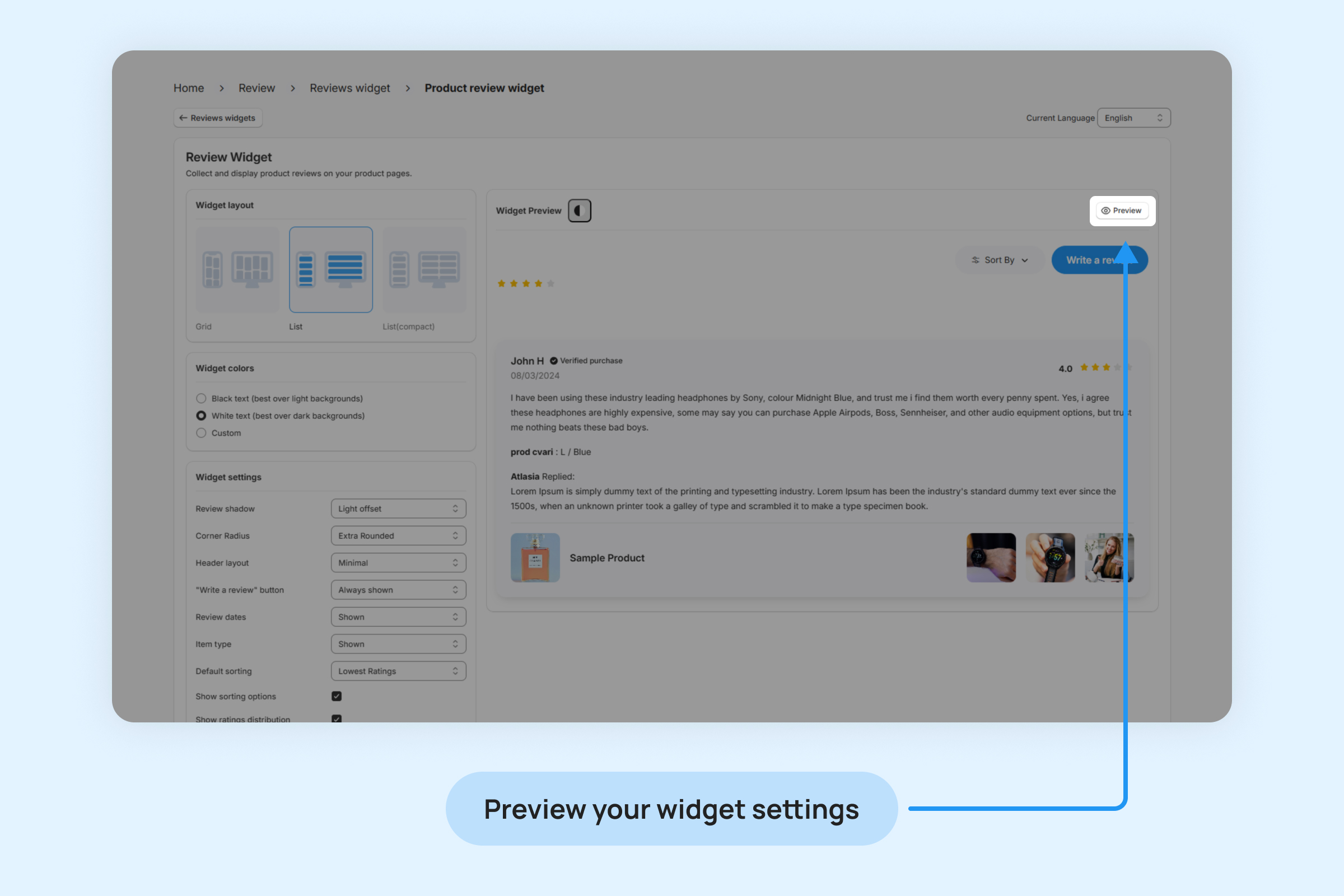
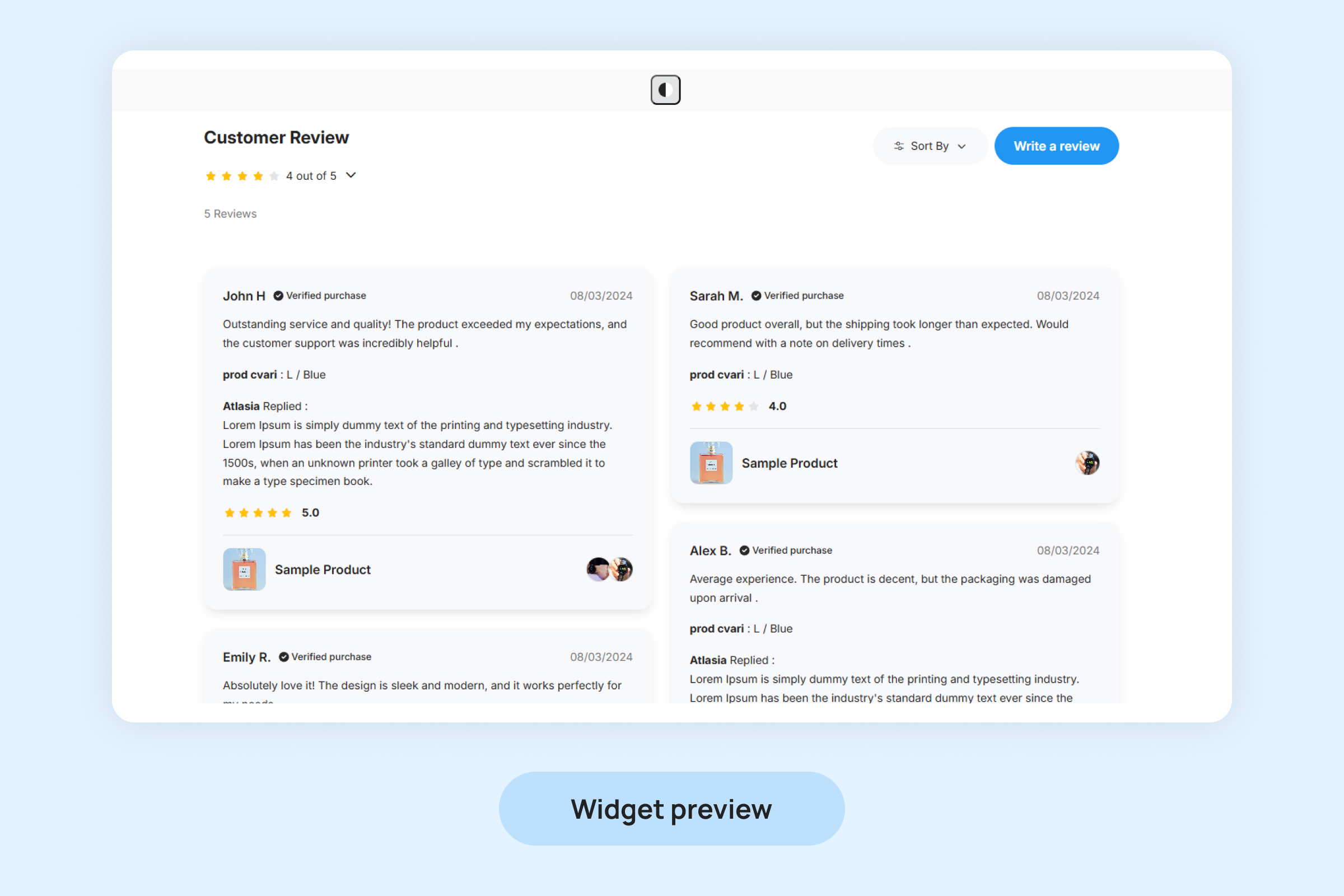
Preview Your Widget Settings
The “Preview” button allows you to view a live demonstration of all the changes made to your widget’s settings in real time. This includes layout adjustments, color customizations, text modifications, and other settings.
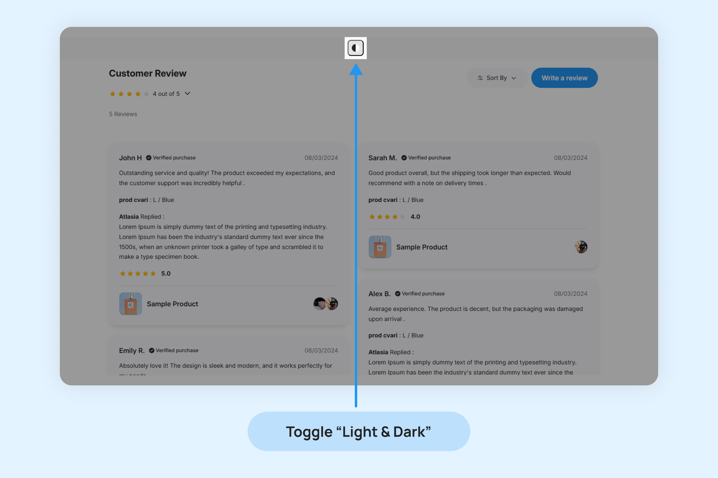
Toggle Dark/Light Theme
Click this icon to switch between the dark and light themes of preview, providing a personalized and accessible viewing experience.