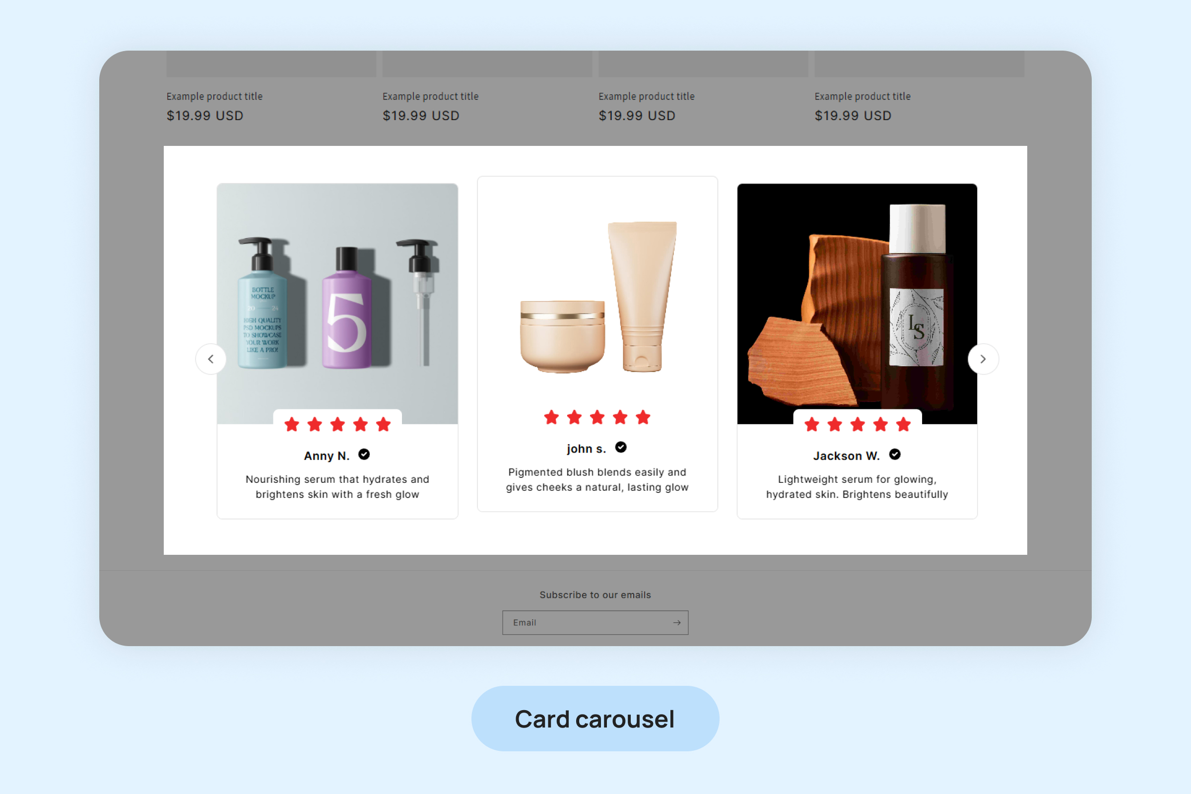
Dropstars Cards Carousel Widget
The Cards Carousel Widget allows you to showcase both text and visual content (images or videos) from your customers in a dynamic and engaging carousel. This helps to amplify social proof and build trust with potential customers. Here’s how you can customize the widget
Notes:
- The Cards Carousel widget will only display photo or video reviews. Text-only reviews will not be visible on this Carousel widget.
- For reviews with multiple photos, only the cover photo will appear on the Cards Carousel Widget.
To add the Cards Carousel Widget to your pages:
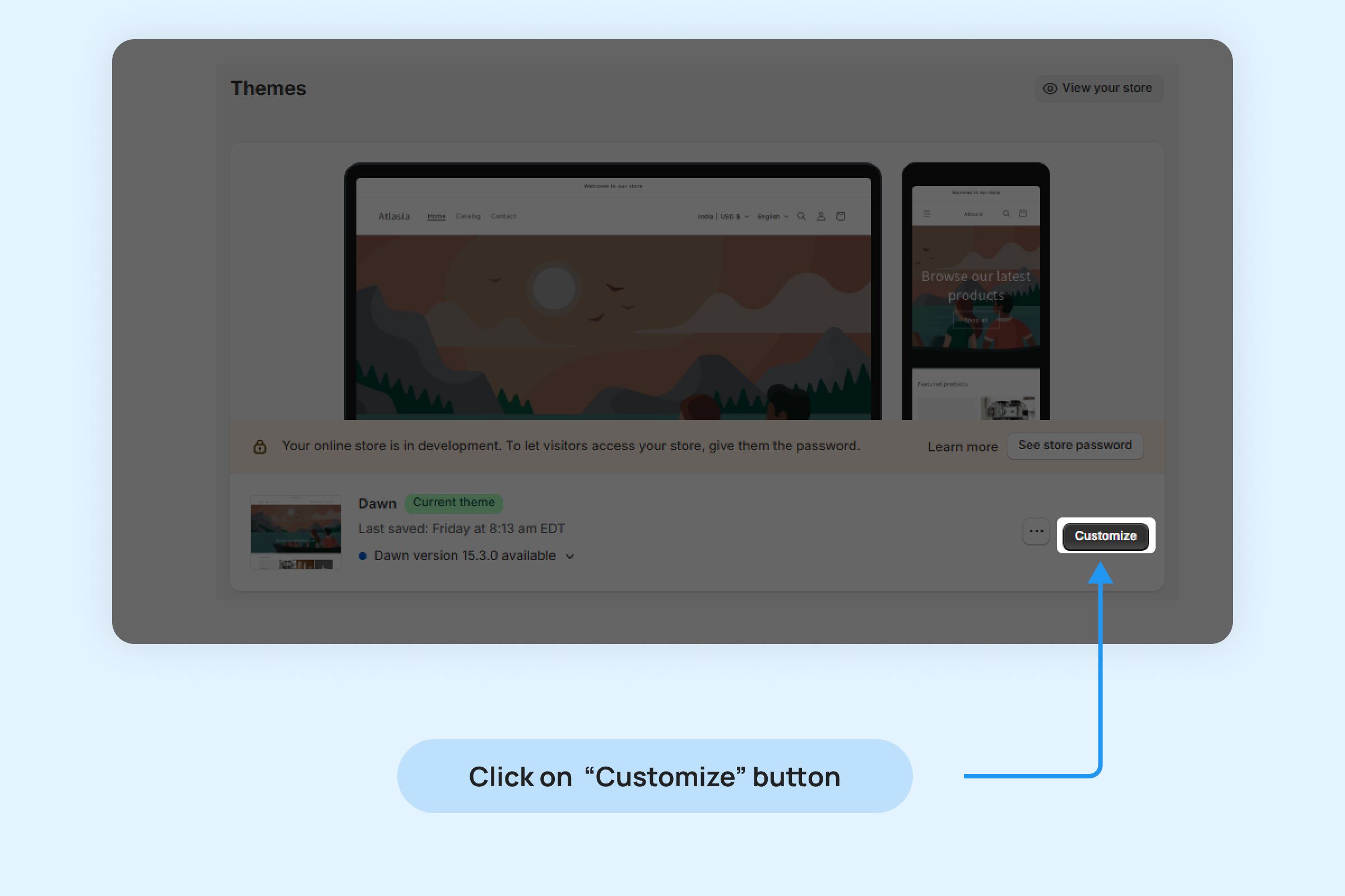
- Inside your Shopify Themes menu, click “Customize” to open the Theme Editor:
- Click “Add section” in the bottom-left corner and choose “Cards Carousel Widget.”
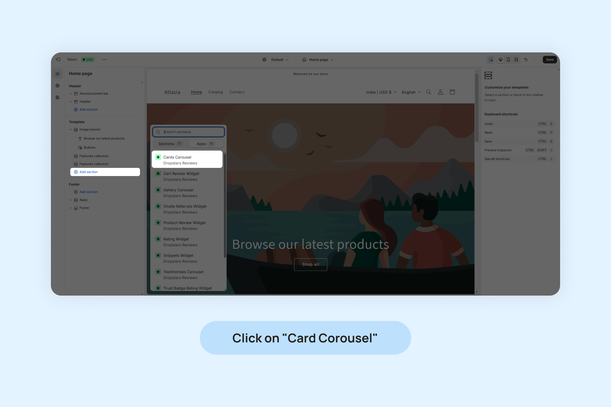
- Drag and position the widget app block to your desired location on the page.
- Click On “Save”.
You can customize widget from below settings:
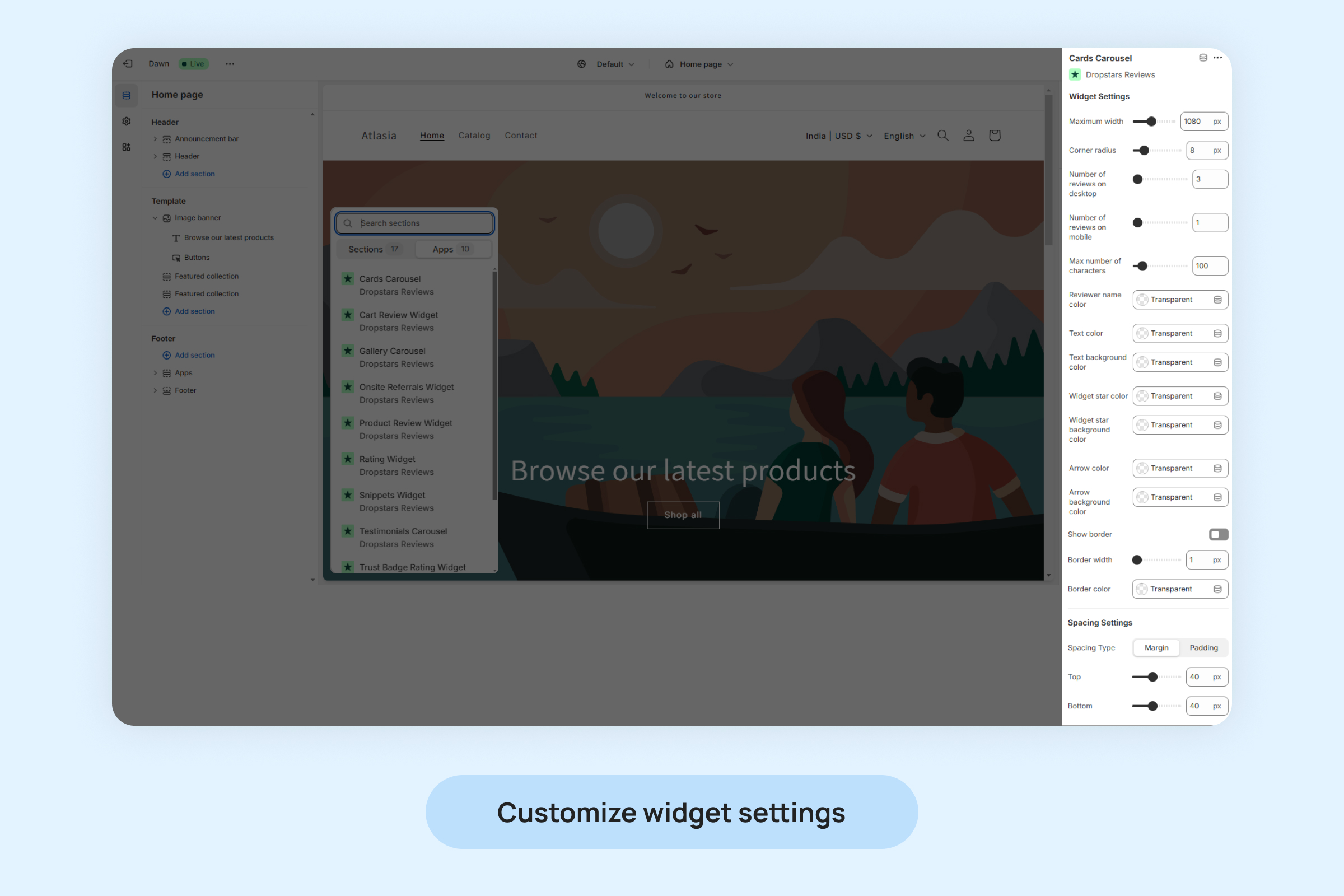
- Maximum width: Set the maximum width for the widget to fit seamlessly into your store’s design layout.
- Corner radius: Adjust the rounding of the widget’s corners for a softer or sharper appearance, depending on your branding.
- Number of reviews on desktop: Choose how many reviews to display in the widget when viewed on a desktop device.
- Number of reviews on mobile: Define how many reviews should be visible in the widget when viewed on a mobile device.
- Max number of characters: Limits the number of characters shown in each review to maintain a clean layout.
- Reviewer name color: Customize the color of the reviewer’s name to align with your brand’s design.
- Text color: Customizes the color of the review text to match your store’s aesthetic.
- Text background color: Customizes the background color of the review text.
- Widget stars color: Select the color for the star ratings displayed with each review.
- Widget star background color: Select the background color for the star ratings.
- Arrow color: Set the color of the navigation arrows to make them visible and consistent with your widget design.
- Arrow background color: Choose a background color for the navigation arrows to enhance their appearance or contrast.
- Show border: Enable or disable a border around the widget for a more defined look.
- Border width: Specify the thickness of the border around the widget.
- Border color: Set the border color to complement your store’s design.
- Spacing Settings: Adjust margins and padding to control the spacing around the widget.
Managing the addition and removal of reviews in the Cards Carousel Widget.
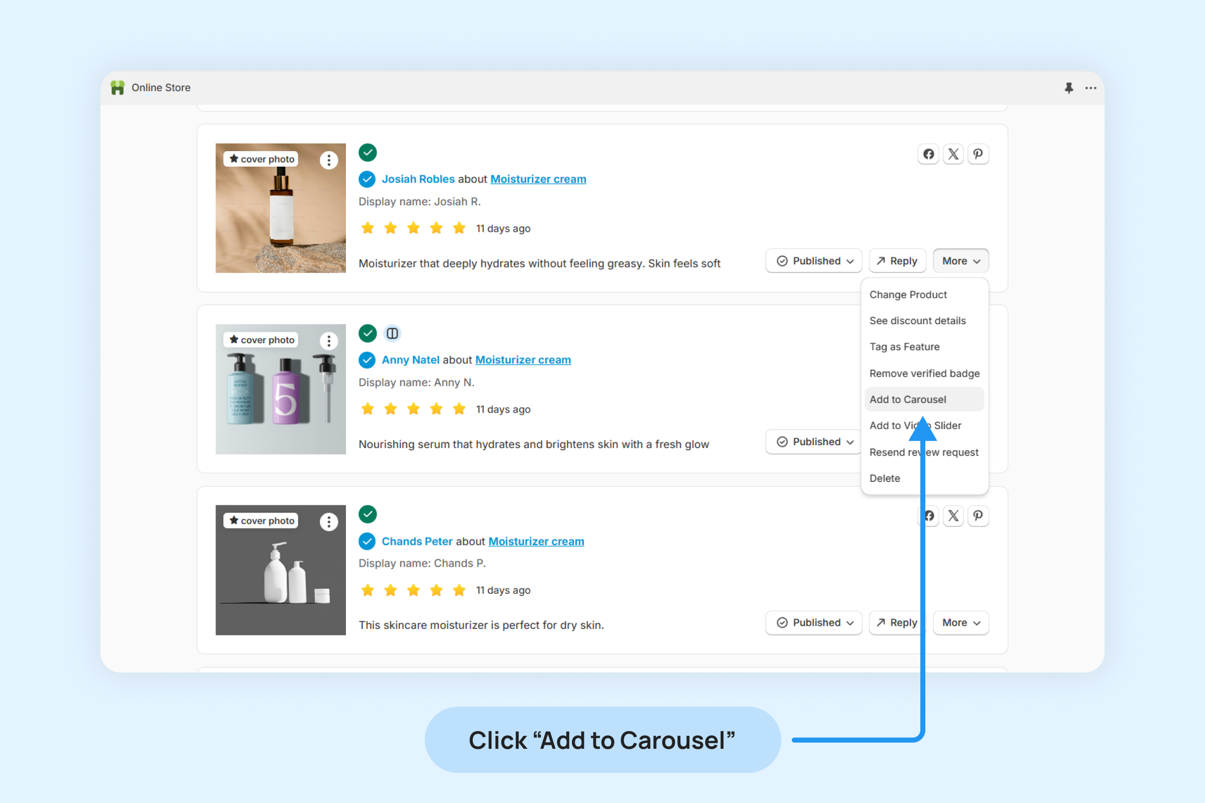
To include or exclude a review in your Cards Carousel Widget:
- Navigate to “Review ->Manage Reviews” and locate the desired review.
- Click on the “More” button on the review.
- Choose “Add to Carousel” from the options.
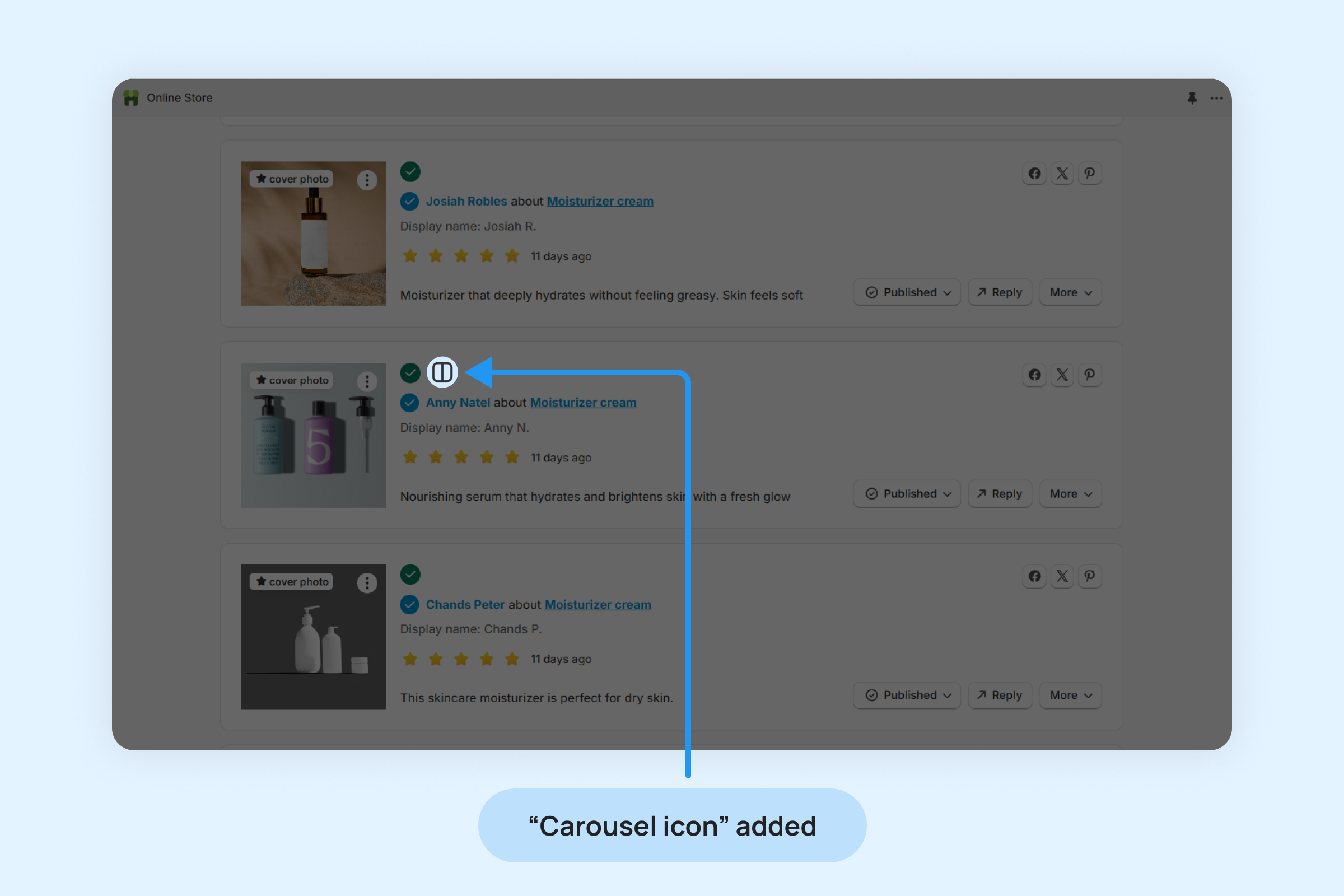
- Once a review is added to the Carousel widget, a Carousel icon will appear on that review, indicating its inclusion in the widget.
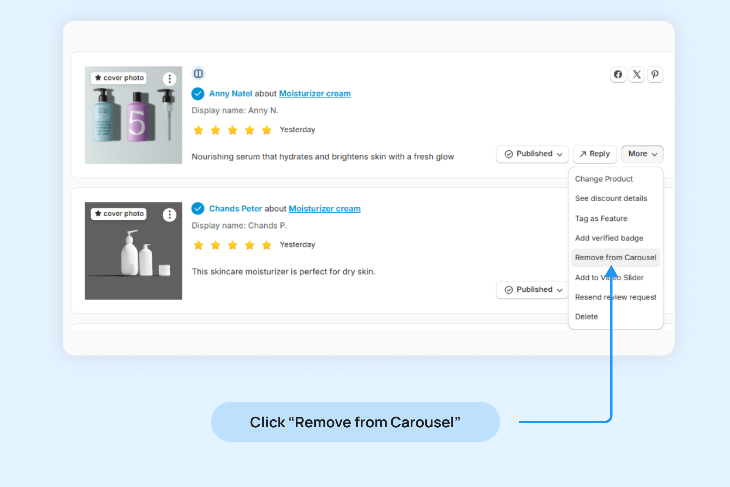
To remove a review from the Carousel Widget:
- Click on the “More” button on the review
- Select the “Remove from Carousel” option from the drop-down menu.